Production Artist
2022-Persent
At Inspired Thinking Group I am tasked with creating weekly print and digital grocery ads. Most pages are built using a template while others are customized for each client. Below are examples of pages I have worked on with my team, I have detailed my specific tasks for each page.
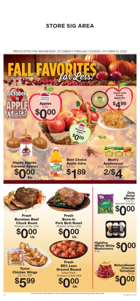
October is Apple month. I found and modified the apple clip art and created a layout featuring all the apple deals. At the same time leaving room for the other features.
Matching each item with a special beauty image can be difficult while staying in season. Here I created the bursts and as a team we chose the best beauty images to fit the products they represent.
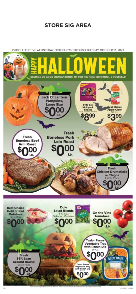
Sometimes you have the perfect image and the jack-o-lantern burger worked out perfectly. Custom bats in front of a moon background and cauldron bursts brought the whole front page together.
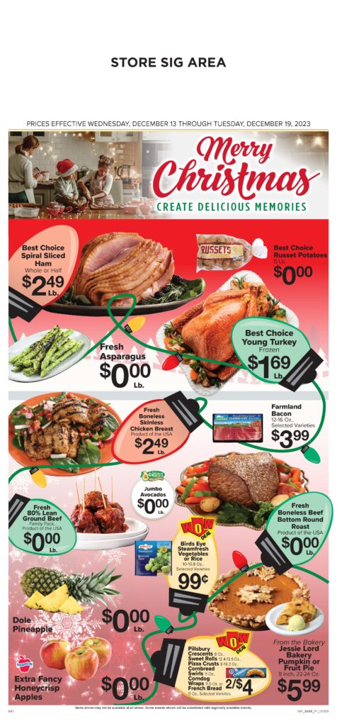
Merry Christmas Lights! I wanted to create something fun and festive and while it might also be busy, it fits the theme. The string of lights keep your eye moving through the ad to find all of the different offers.
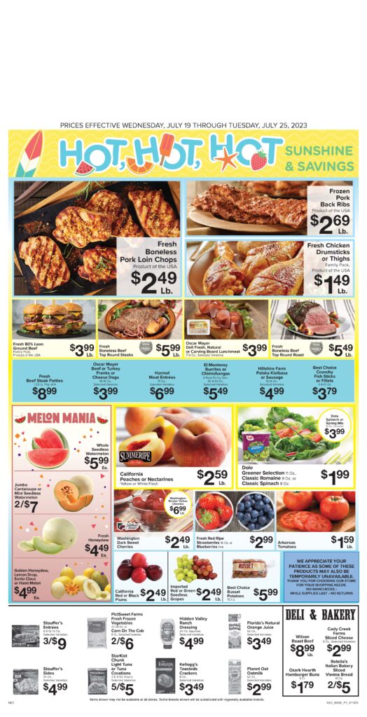
The Melon Mania section is atypical for this ad template so I redesigned where everything went to fit this section along with adding the confetti elements.
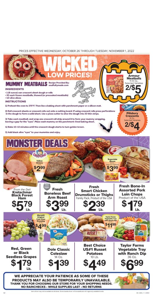
The candy-corn text boxes were created to fit the Halloween theme, as well as using the other clip art elements like the bat, pumpkin and mummy. Sometimes there’s a recipe as well which I laid out for flow and consistency.
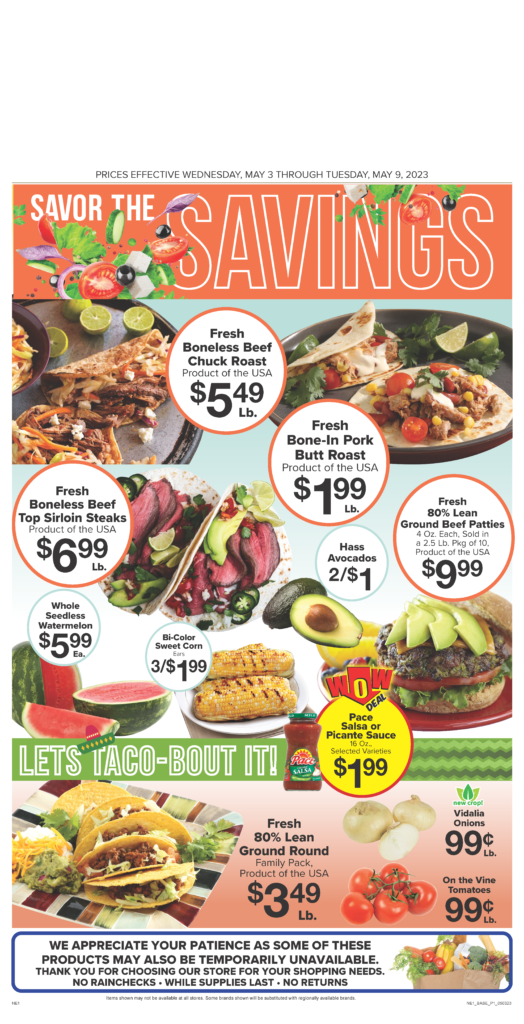
The client wanted as many images as possible to be tacos and I found and edited the ones to make them fit seamlessly. I created the “Let’s Taco-bout it!” banner adding the chevron and sombrero to tie everything together.
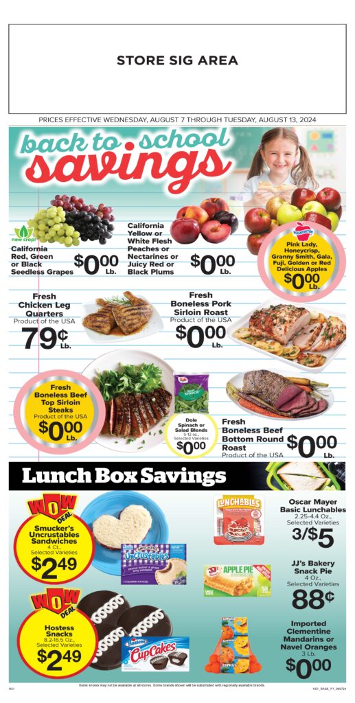
Custom pencil bursts and a section for items to put in a lunchbox. Sometimes working with a simple grid layout is best and in this case fits the theme.
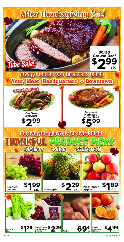

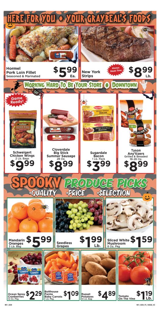
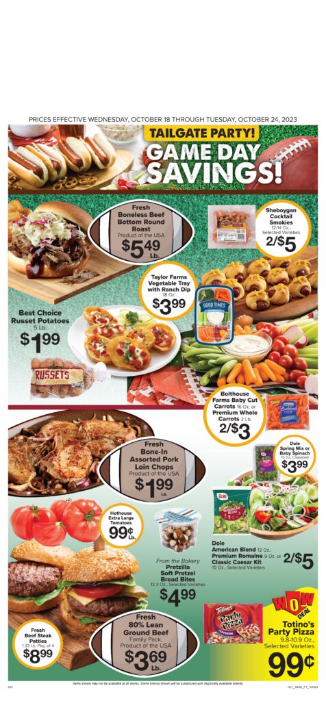
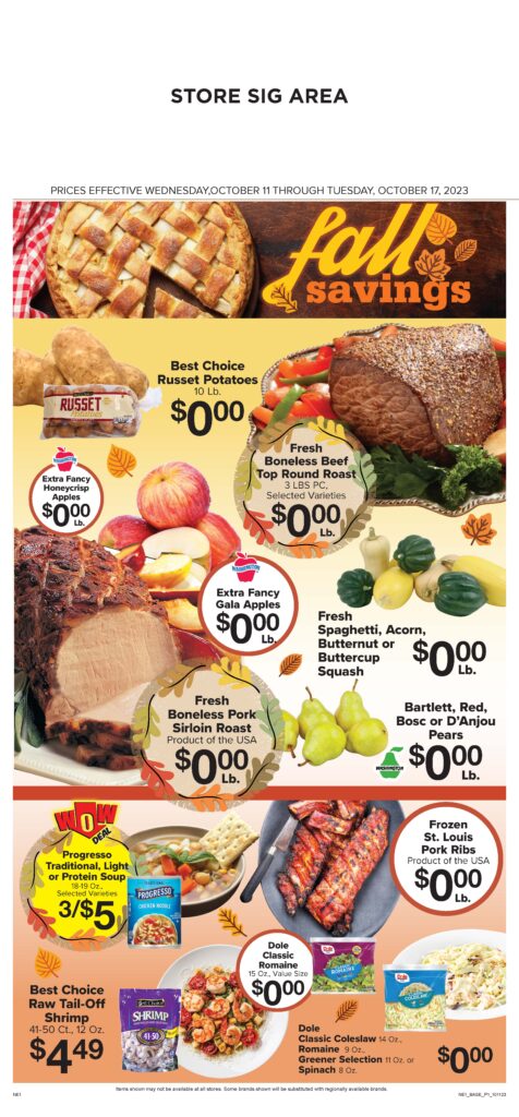
In these six ads I added backgrounds, art and chose typefaces according to that week’s theme . The client asked for bold colors and with them the more the better. Each page starts as a blank template with the box grid and space for each grocery item. Another team member fills in all of the grocery items.
Before and After
On the left is how I originally laid the page out and
the right is what the client approved. From the time the ad is built until approval many things factor into what ends up on the final page; client preference or item availability. While this design has mostly stayed the same, the client choose to have a few elements featured that weren’t originally and a couple items either moved to a separate page or where removed from the ad completely. This demonstrates that good design is important, but at the end of the day I have to create for the client and they have the final aproval.